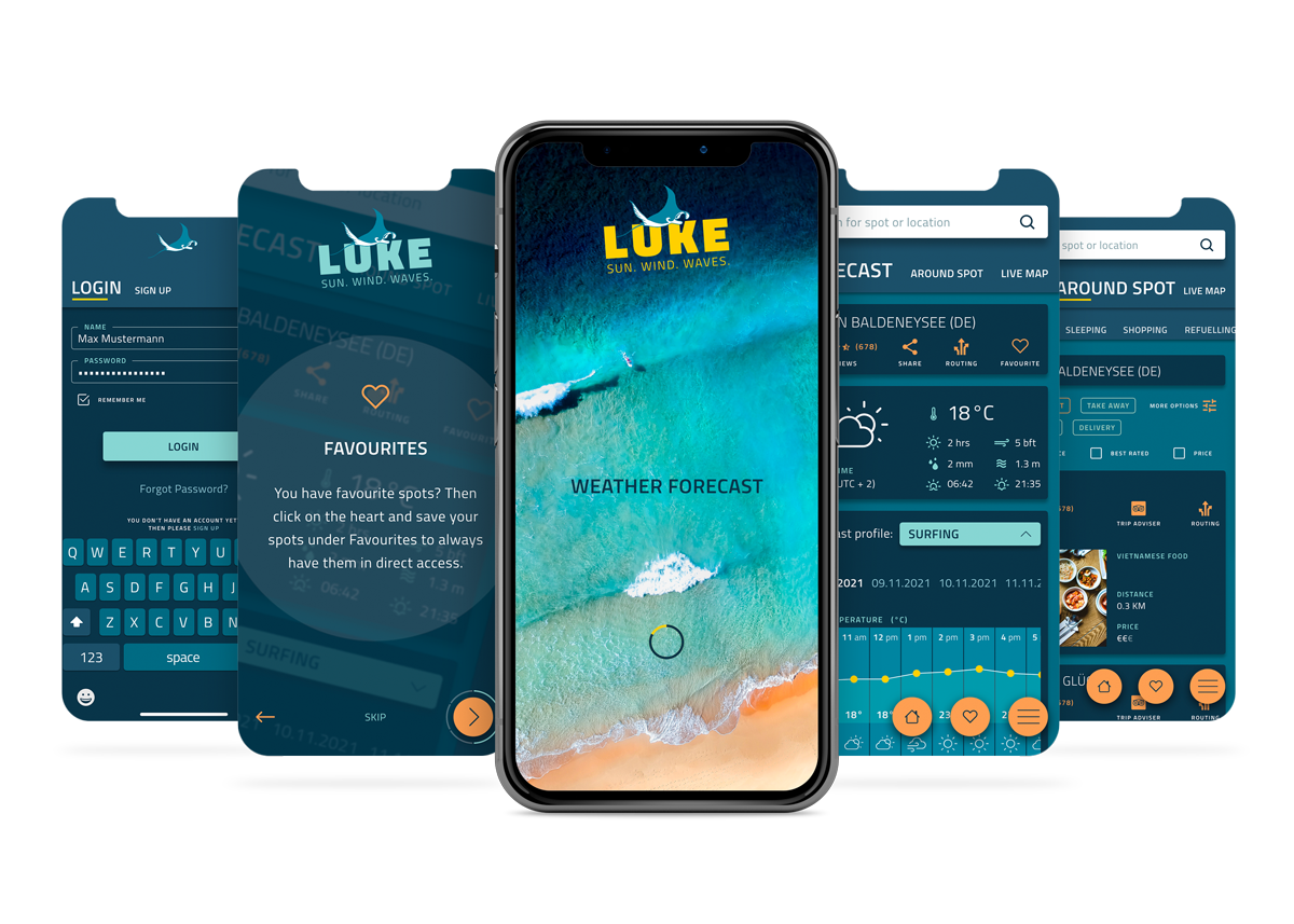
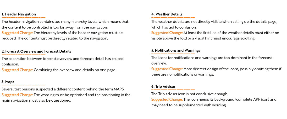
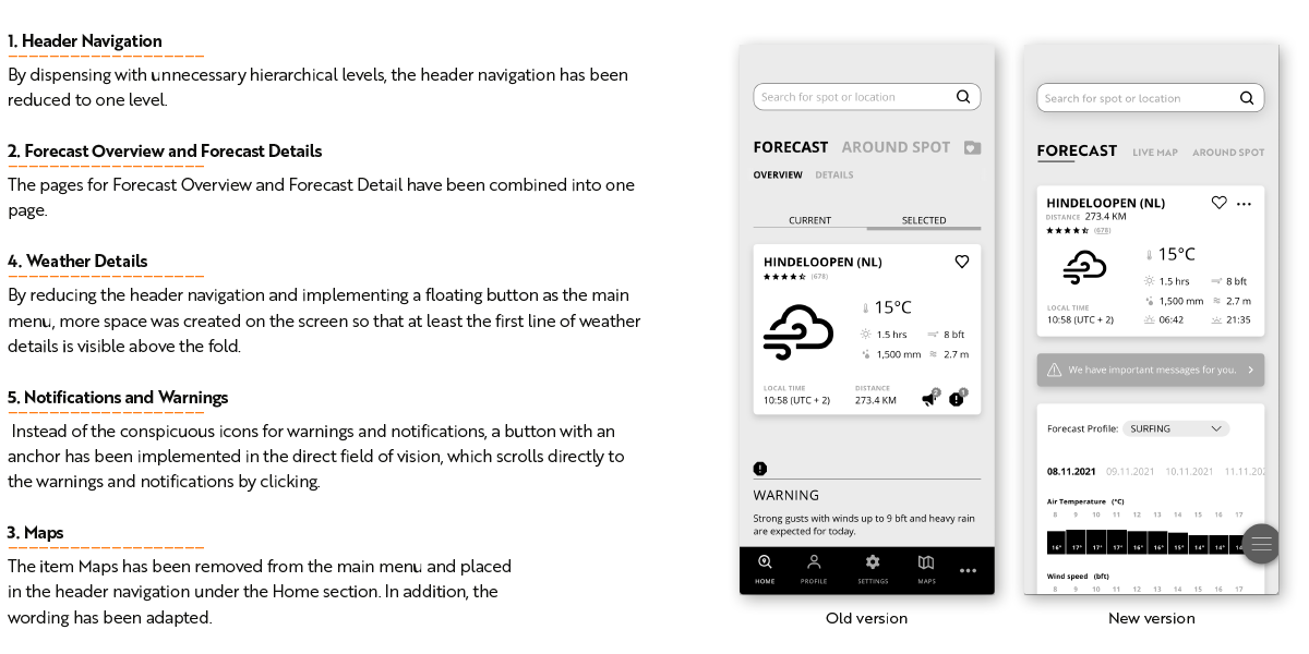
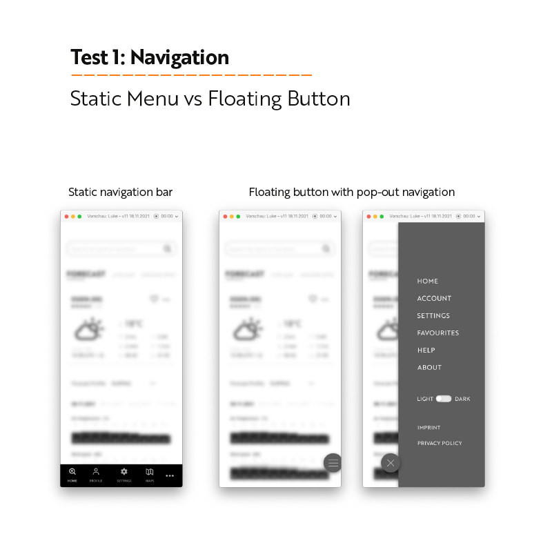
The main task of the VELA app is to provide water sports enthusiasts such as surfers, kiters and sailors with easy-to-understand and clear weather forecasts, wind and wave reports that enable them to safely plan their sports activities on or near the water.
They should be able to search for spots, save favourite spots and trigger alerts when certain weather conditions are predicted at their favourite spot.
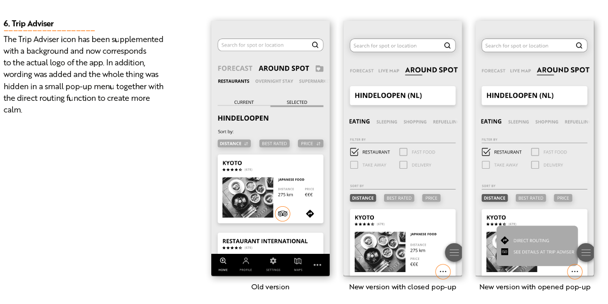
In addition, the app provides useful information about the respective spot, such as shopping and accommodation options, to make planning even more convenient. Various customisation options for the display of individual screens round off the experience.
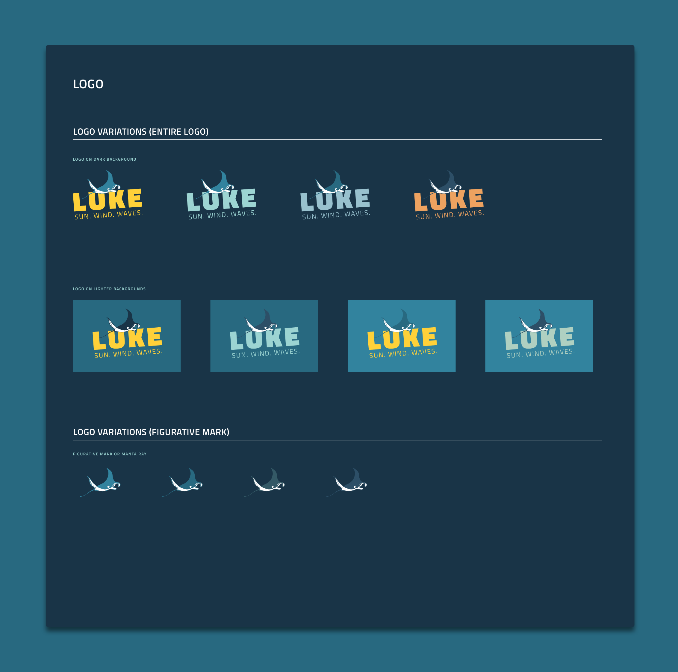
Two men are the sponsors of the app’s name. One is Luke Howard, the „Godfather of Clouds“, who was the first to classify cloud formations at the beginning of the 19th century and thus founded modern cloud science. The second is Luke Skywalker, who has little connection to the weather but can predict future events with his psychic abilities, which corresponds to the main task of the app, namely to predict the weather.
Project
The project was the core Task of my one-year training as a UX designer at CareerFoundry and followed the approach of design thinking.
Role
I carried out the project as a solo fighter. This means that I carried out all facets of UX design myself, from the initial research to the hi-fi prototype. I was supported by my mentor Omri Ginzburg and my tutor Mona Biljeek.
Tools
Adobe XD Adobe Illustrator Adobe After Effects Google Forms Miro Lucidcharts Optimal Workshop Usability Hub
Objective
Provide beautifully displayed and easy to understand wind, wave and weather reports, forecasts and statistics for sailors, surfers, divers and any other water sport aficionado.
Context
Days on the water are meant to be everything but stressful. To avoid these, it’s good practice to check the conditions of the wind, waves, and weather near the body of water where we will be having fun. This can help us avoid dangerous situations and better prepare for a day of sailing, diving, or surfing. Existing weather apps aren’t meeting the goal of displaying complex weather data in an accessible, easy-to-comprehend way to people who regularly engage in watersports.
Design Thinking
Become familiar
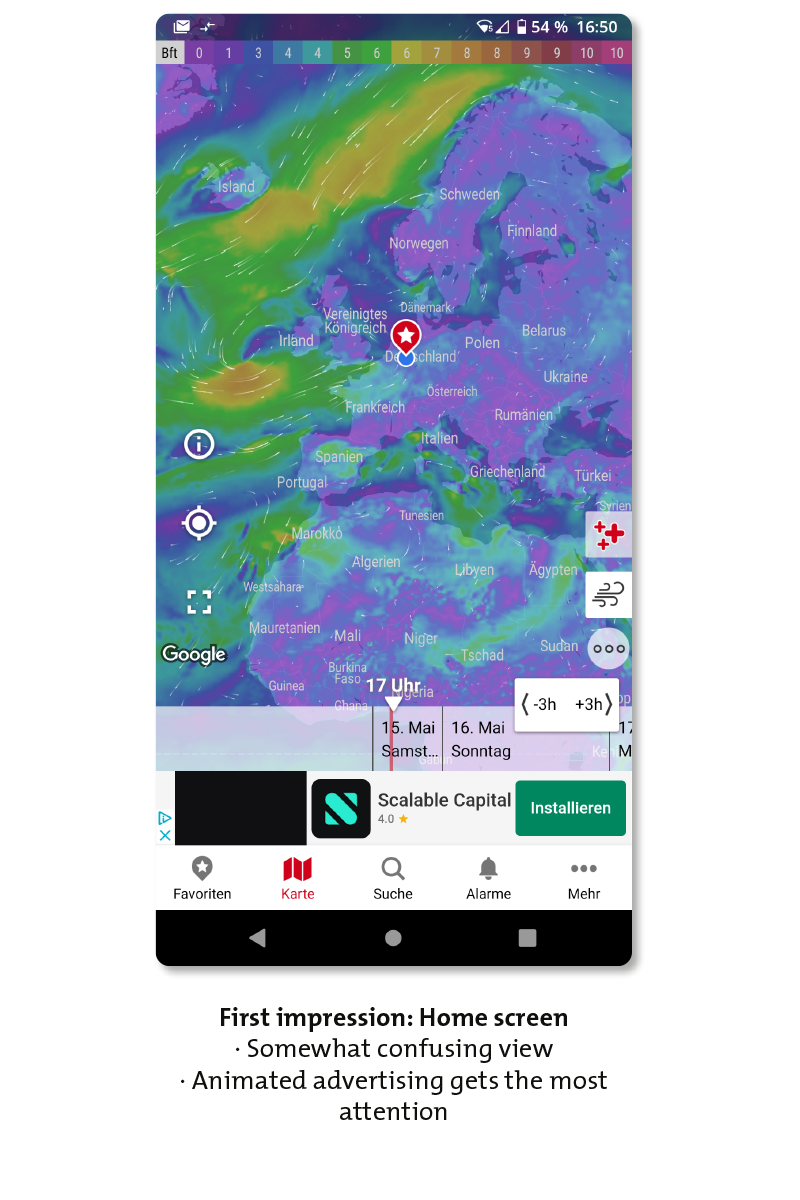
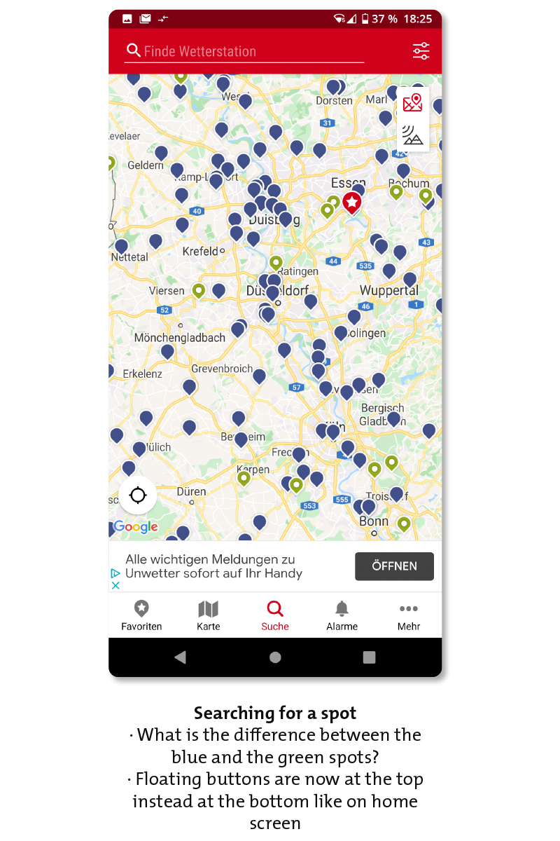
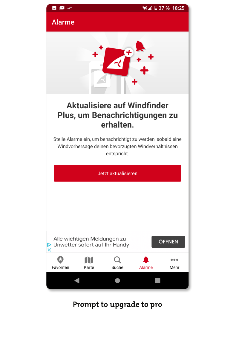
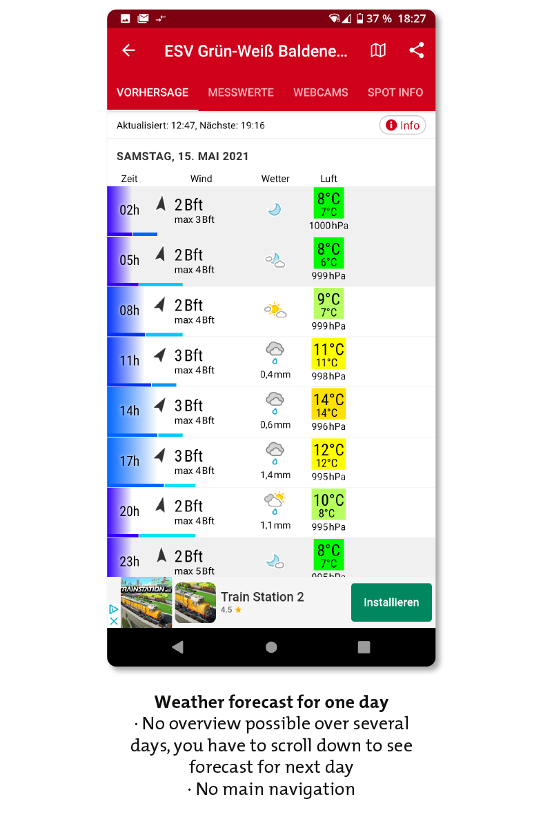
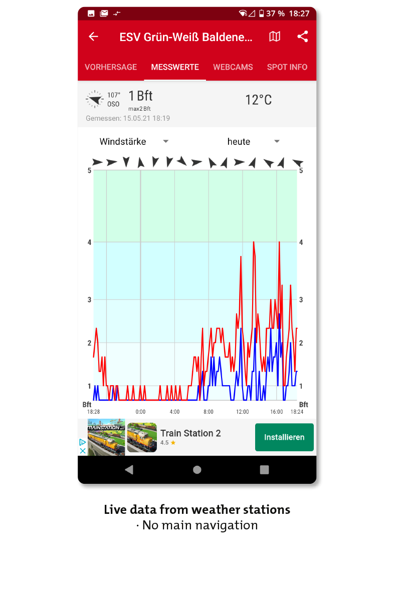
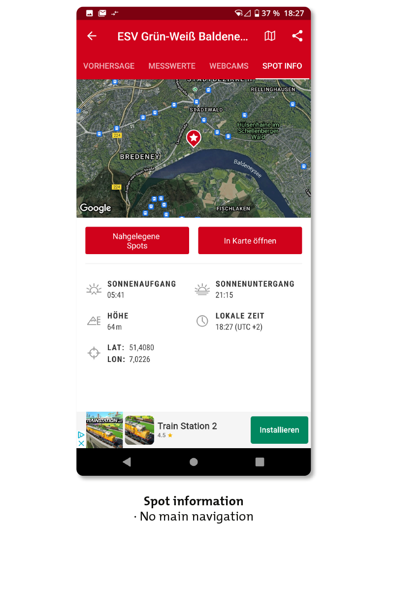
To understand the field that I’m designing in research is the first step. I have to find out about the competitors in the weather app market and perfom a competitor analysis and usability analysis to know what they build and to find possible weaknesses.
The four main competitors
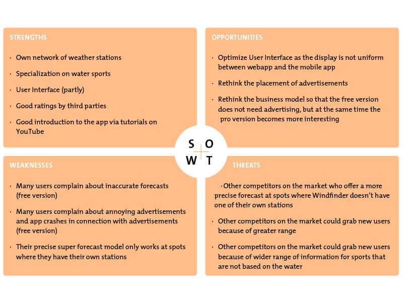
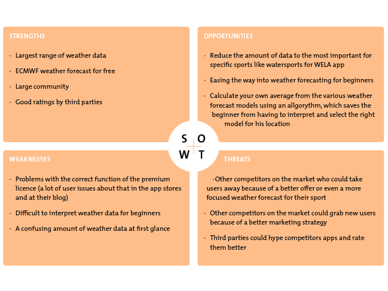
S.W.A.T. Analysis
S.W.O.T. is the analysis of Strengths and Weaknesses, Opportunities and Threats.
I have analysed the two strongest competitors, Windy and Windfinder. I also subjected these two apps to a usability analysis.
From these analyses, I have developed ideas that can give the Luke app an edge over the competition.
Optimize view by displaying summaries of the next days which can be expanded by clicking to see all details
Calculate own average from the various weather forecast models using an allgorythm, which saves the beginner from having to interpret and select the right model for his location
Rethink business model so that the free version does not need advertising, but at the same time the pro version becomes more interesting
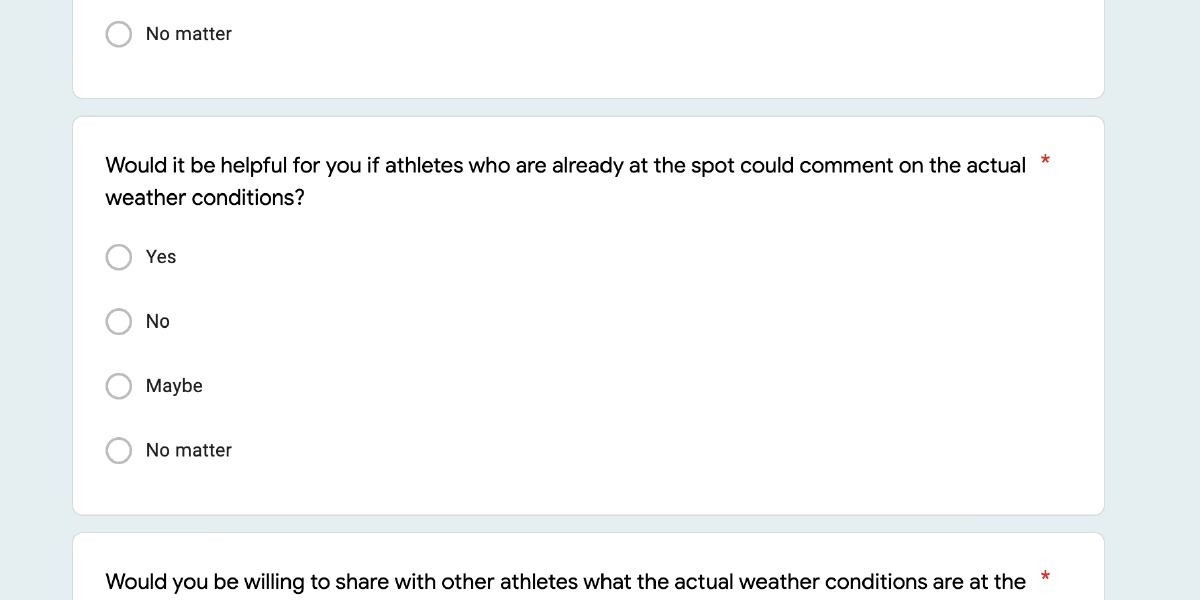
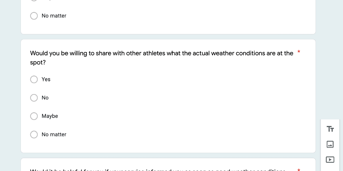
There should be the possibility to have the current forecasts confirmed or corrected by locals
Make presentation of weather data more attractive
Easing the way into weather forecasting for beginners
Attract new user through a broader marketing strategy
Colour scheme could be a little more discreet
User should have the ability to customize or to choose from a selection of schemes
Optimize User Interface and make it consitent between webapp and mobile app
Reduce the amount of data to the most important for specific sports
Problemstatement
The user needs a way to get a simple and quick overview of the weather situation at the selected spot without beeing overhelmed by confusing information overload because it enables him to quickly make an initial decision as to whether, for example, the conditions are good for surfing before calling up more in-depth information to plan a safe and enjoyable day on the water.
We will know this to be true when we see a lot of traffic at the website and recurring users and if we have good reviews on water sport blogs, magazins and websites.
Get to know the user
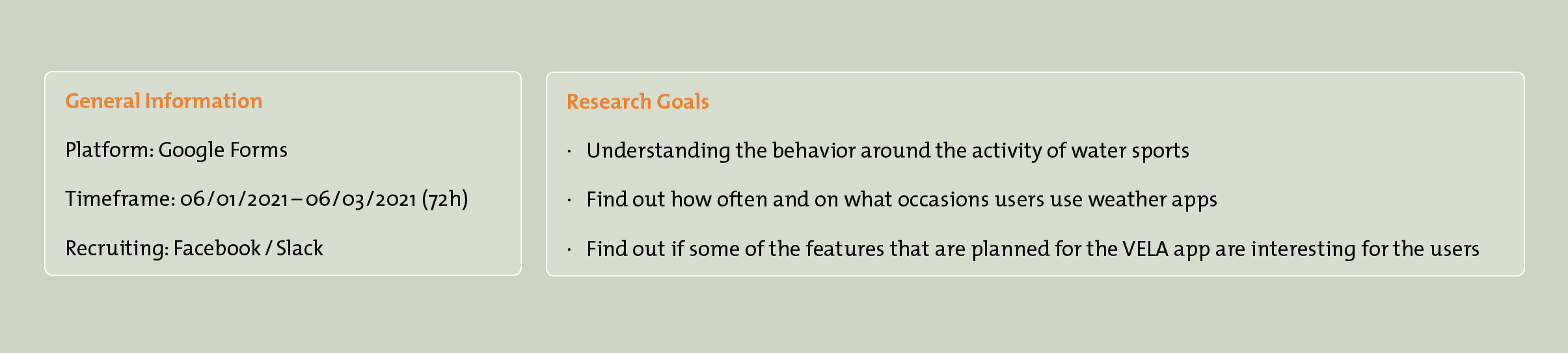
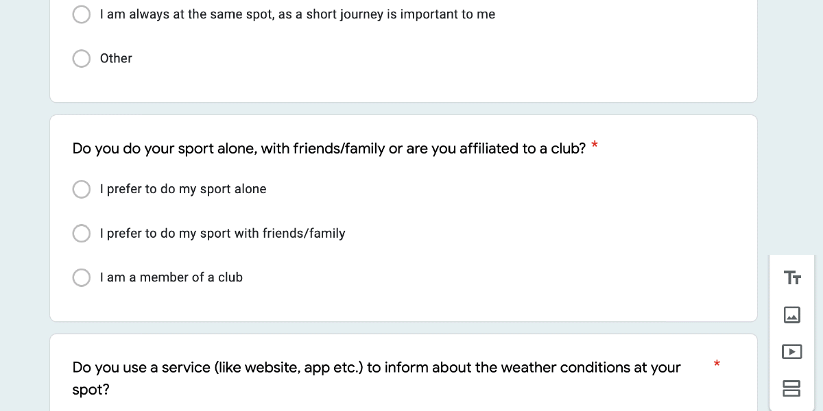
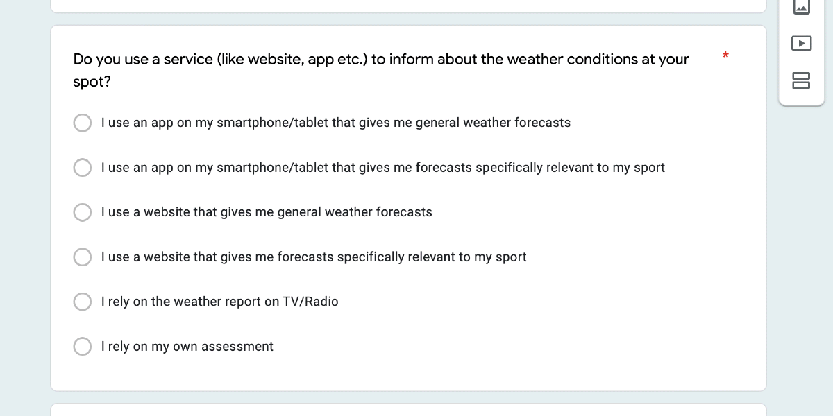
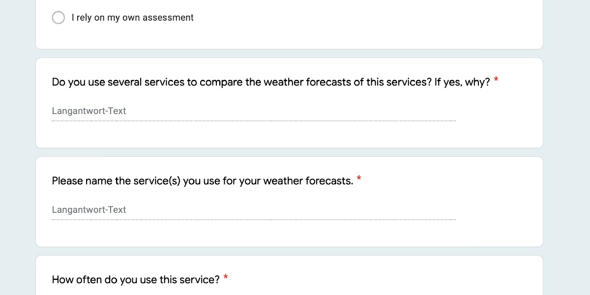
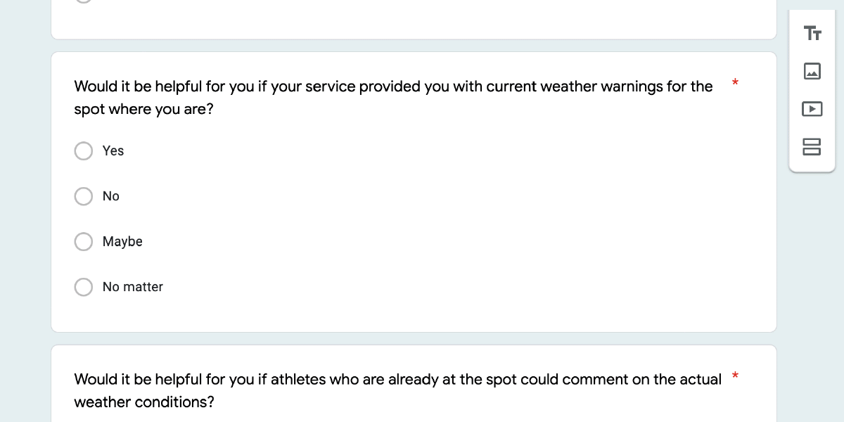
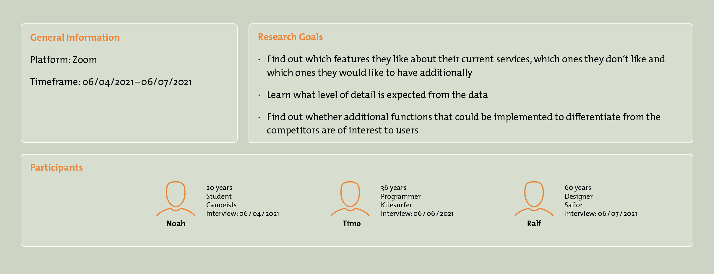
To understand what matters to users, where their difficulties lie when using comparable apps, what they expect from an app and how they use the apps, I conducted surveys and interviews.
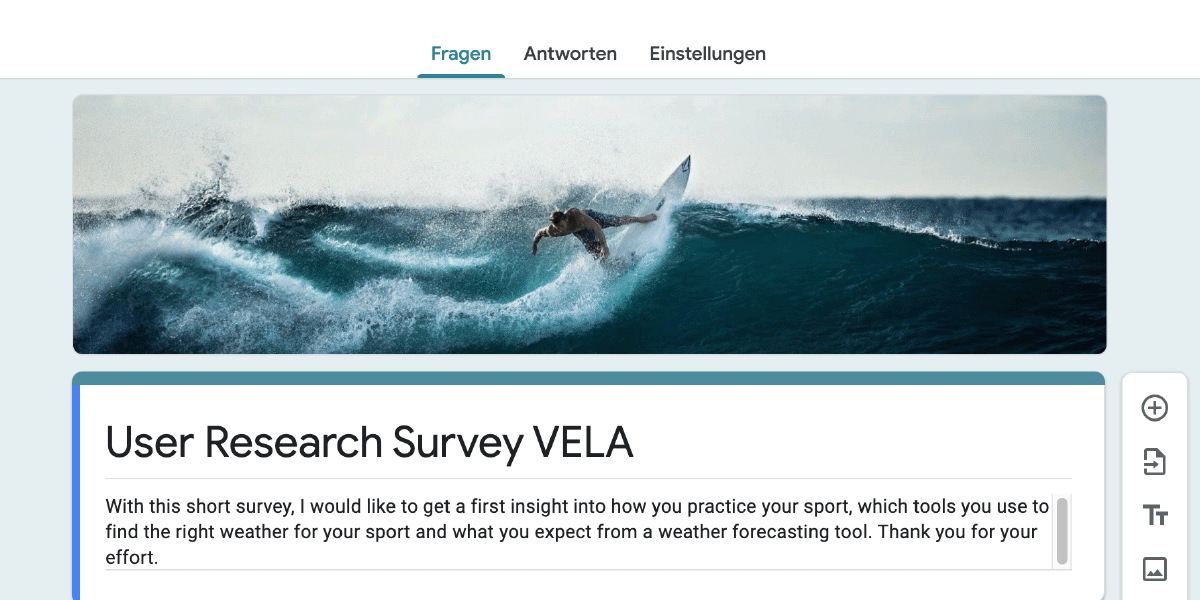
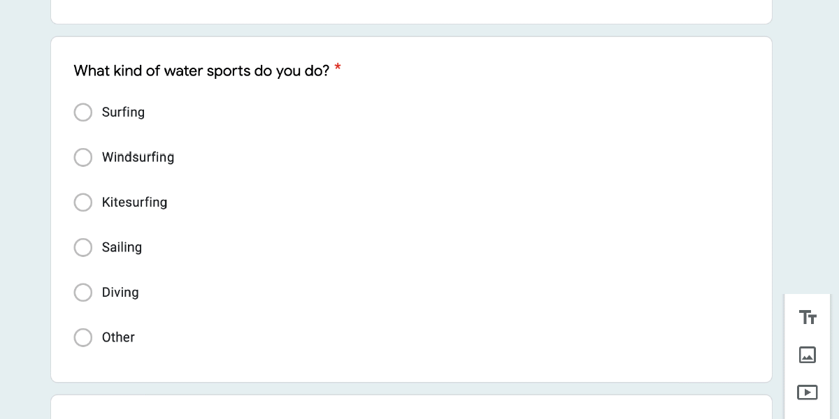
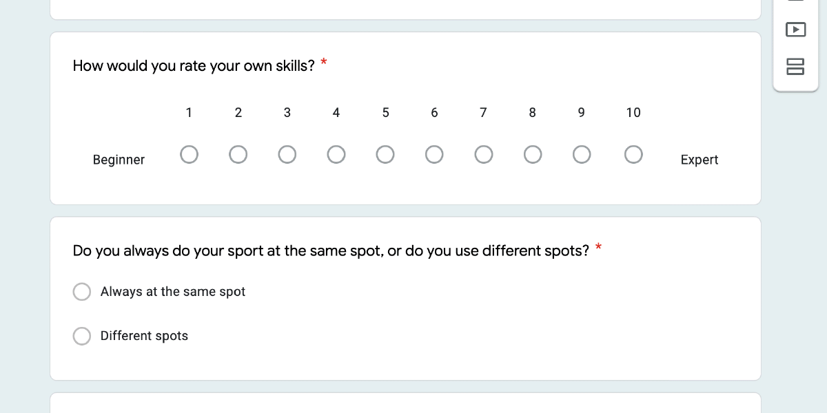
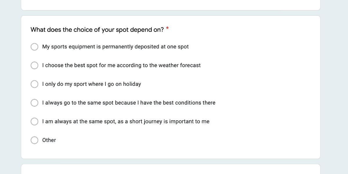
The survey was created with Google Forms and the in-person interviews were conducted remotely via zoom.
Conducting User Survey
Survey insides
0%
use an weather app
0%
use a sport specific app
0%
use a general weather app
0%
practice their sport at different spots
0%
use several apps to compare forecasts
0%
would like to receive weather warnings
0%
like it if athletes could comment the actual weather at spot
0%
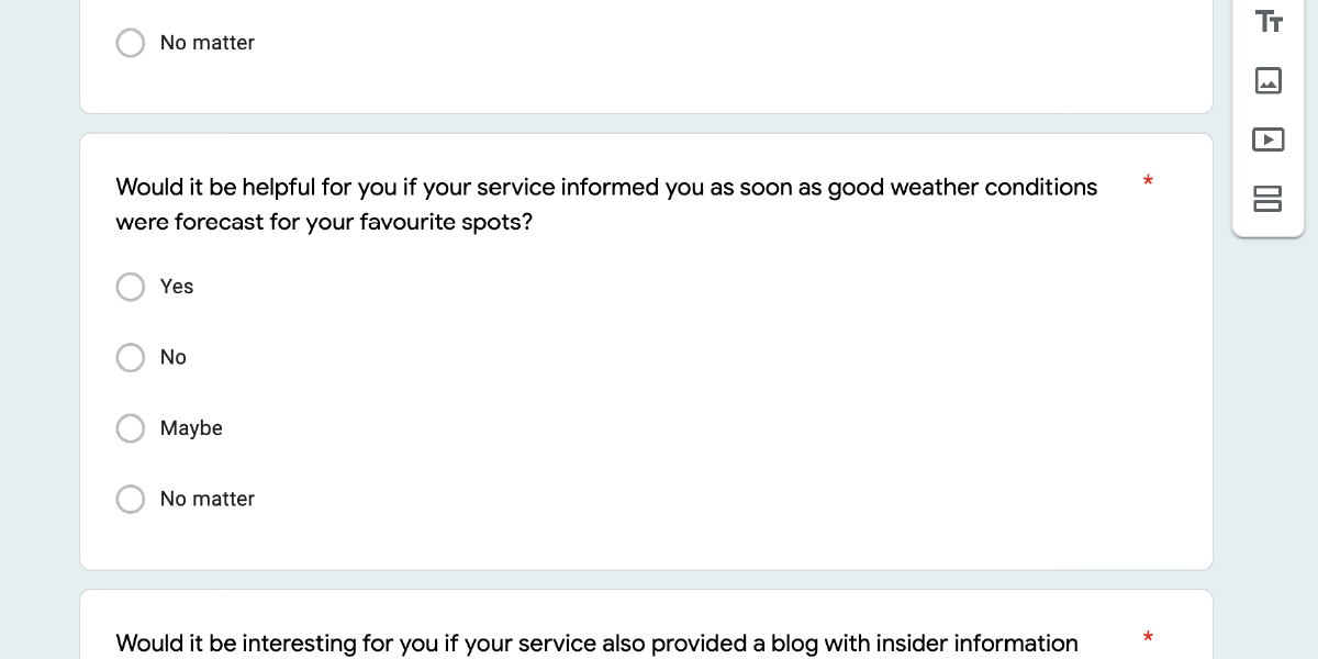
like to be alerted for good conditions at favoutite spots
0%
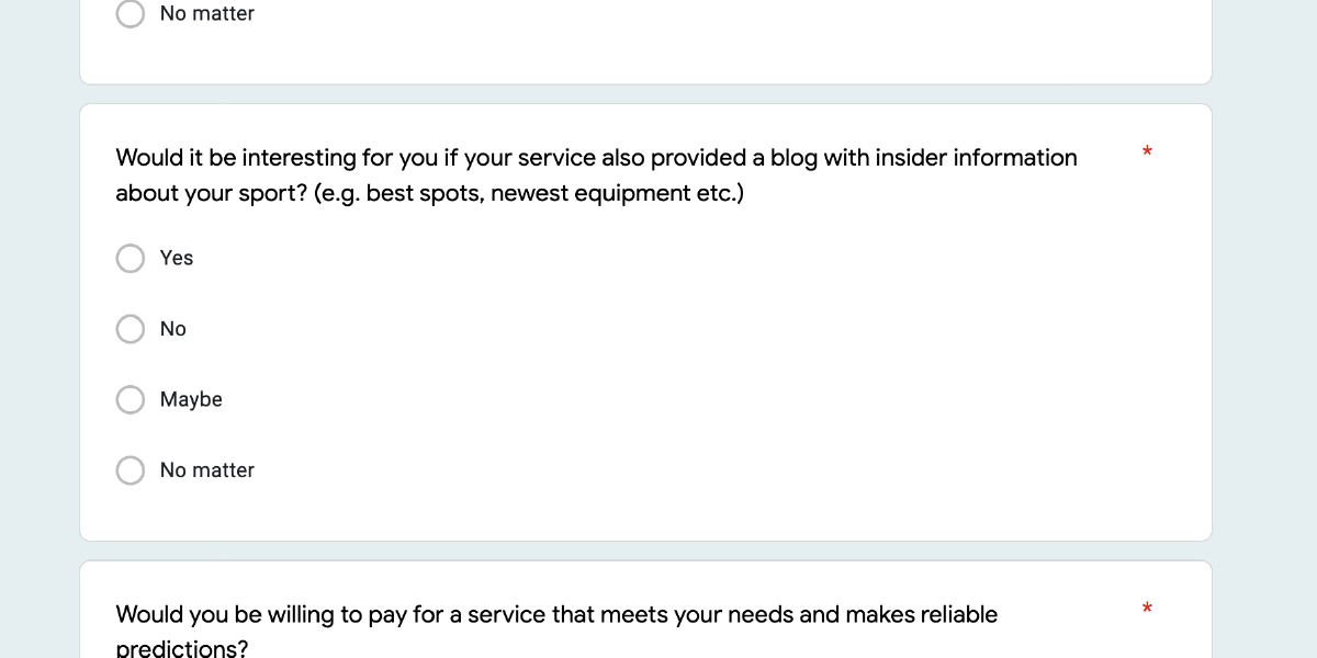
are not interested in a LUKE blog
0%
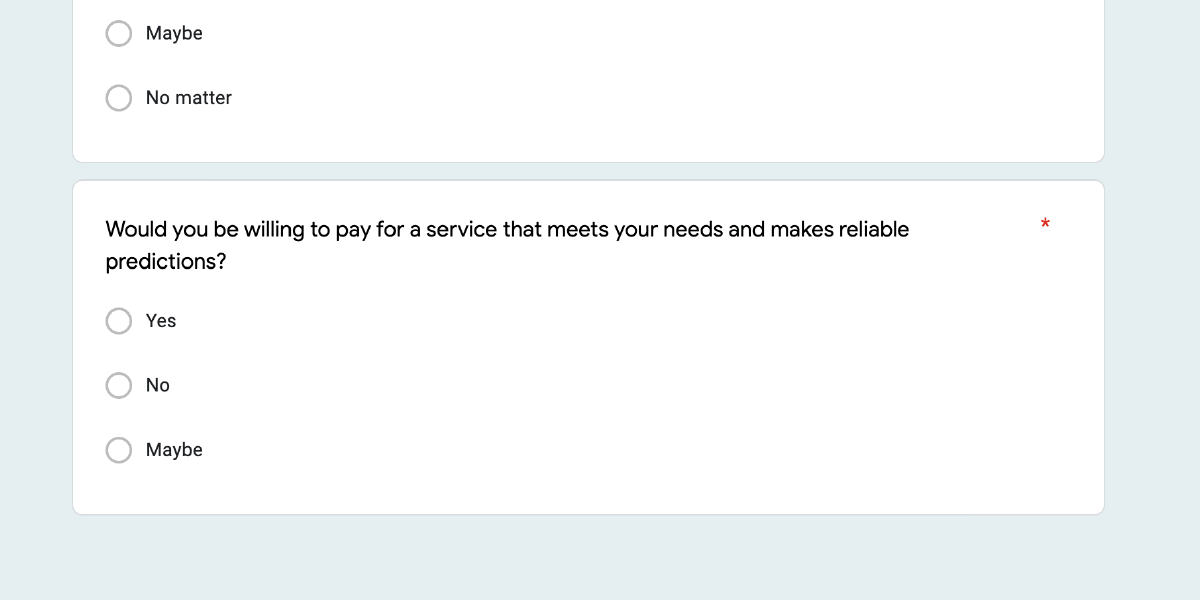
Would be willing to pay for a good app
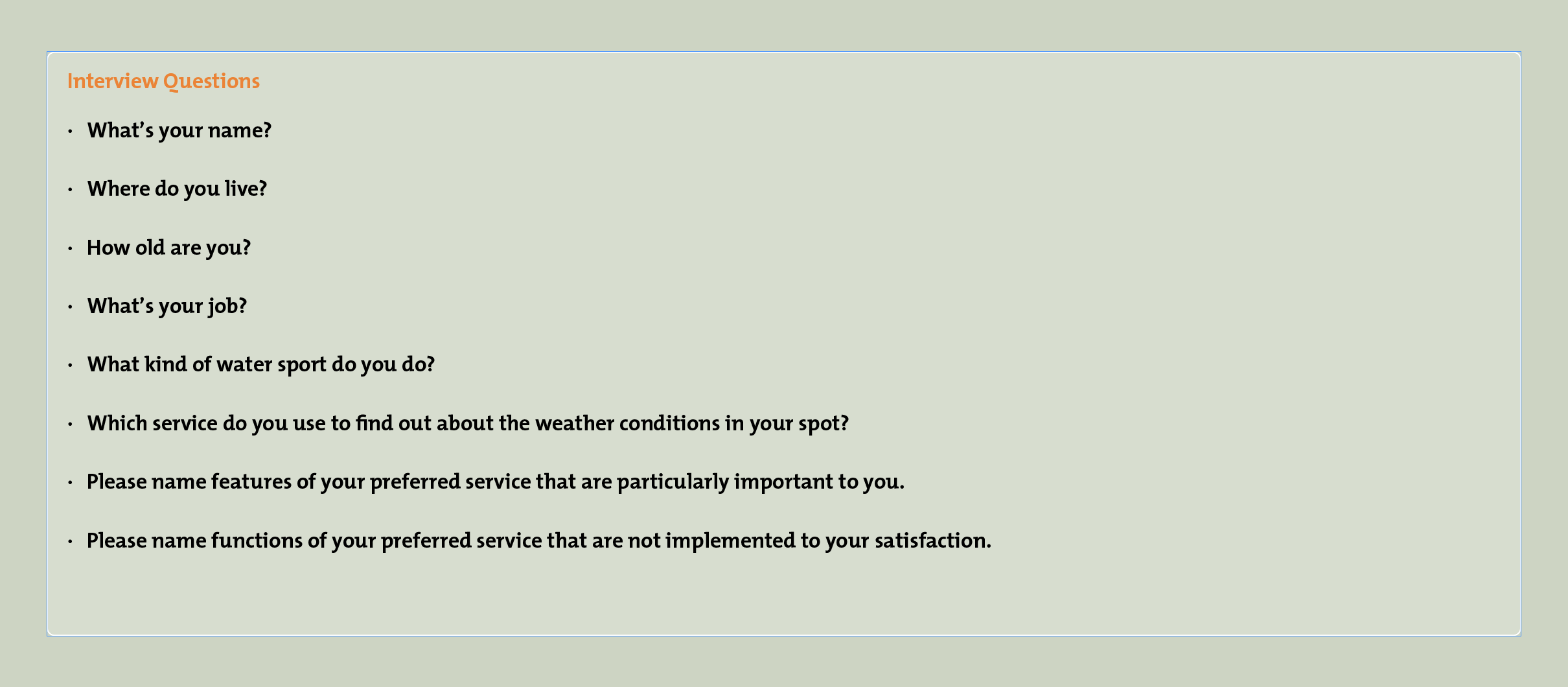
Conducting User Interviews
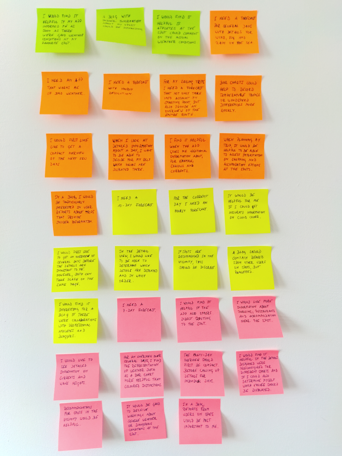
Users Needs & Goals
Interview insides
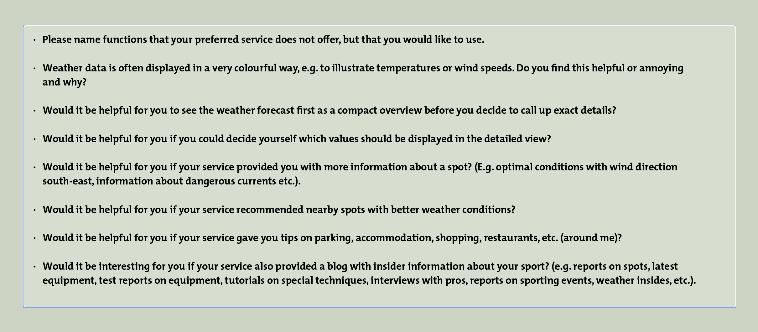
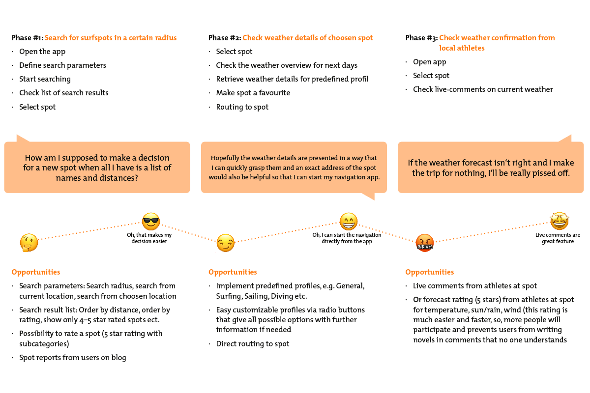
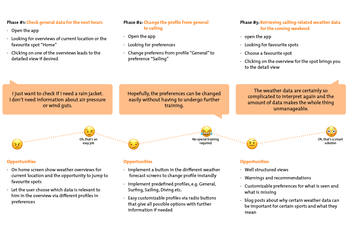
All users consider a multi-day forecast (5 – 10 days) important, but all respondents also know that the further into the future you look, the less accurate the forecasts become.
All users would like to receive a compact overview of the next days before they decide to call up details on individual days.
It is important for all users to be able to determine which data is displayed in the detailed view and in which order.
Users consider the strong colours of weather data to be learned, but are not averse to accepting other forms of presentation if they can be grasped intuitively.
All users would find it interesting if the service offered a blog where they could access qualified user reports on spots.
All users would appreciate it if the service offered additional „around me“ information at the spot, such as restaurants, parking facilities, accommodation etc.
Centre the user
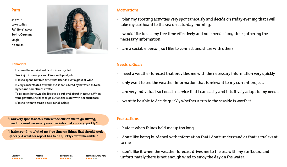
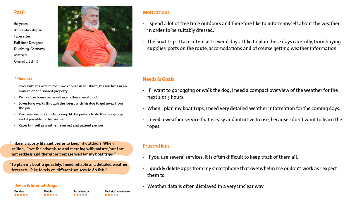
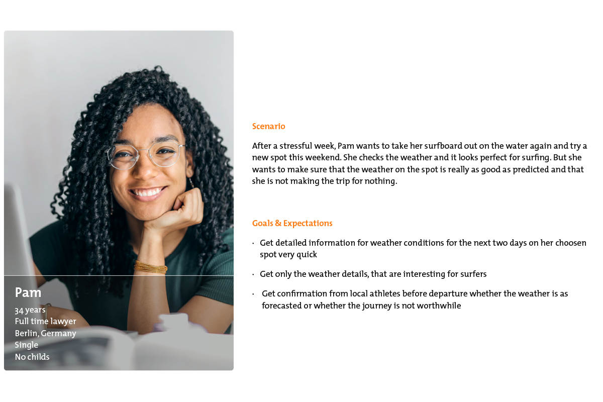
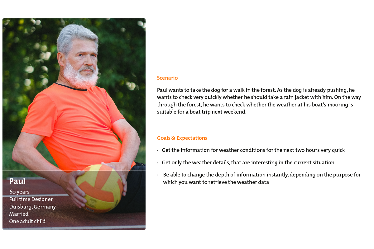
Through the interviews I was able to get a good picture of the users. In addition to specific questions about whether my initial ideas met with interest, I also asked various questions about their personalities, professions, life situations, etc. I was also able to find out whether they were interested in the project. From this I developed two relevant personas. Please meet Pam and Paul.
User personas Pam and Paul
These two personas represent the typical users of the app and accompany the entire further development. They move to the centre of attention. The app was developed for these two in a user-centred design process.
Mental Models Pam and Paul
Start the engine
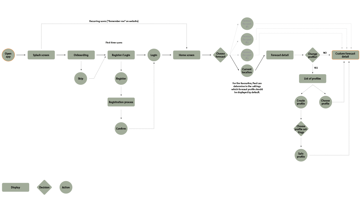
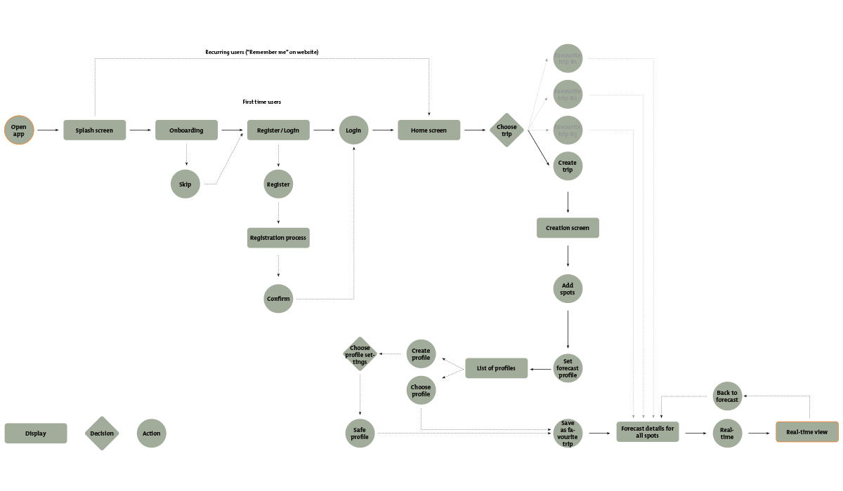
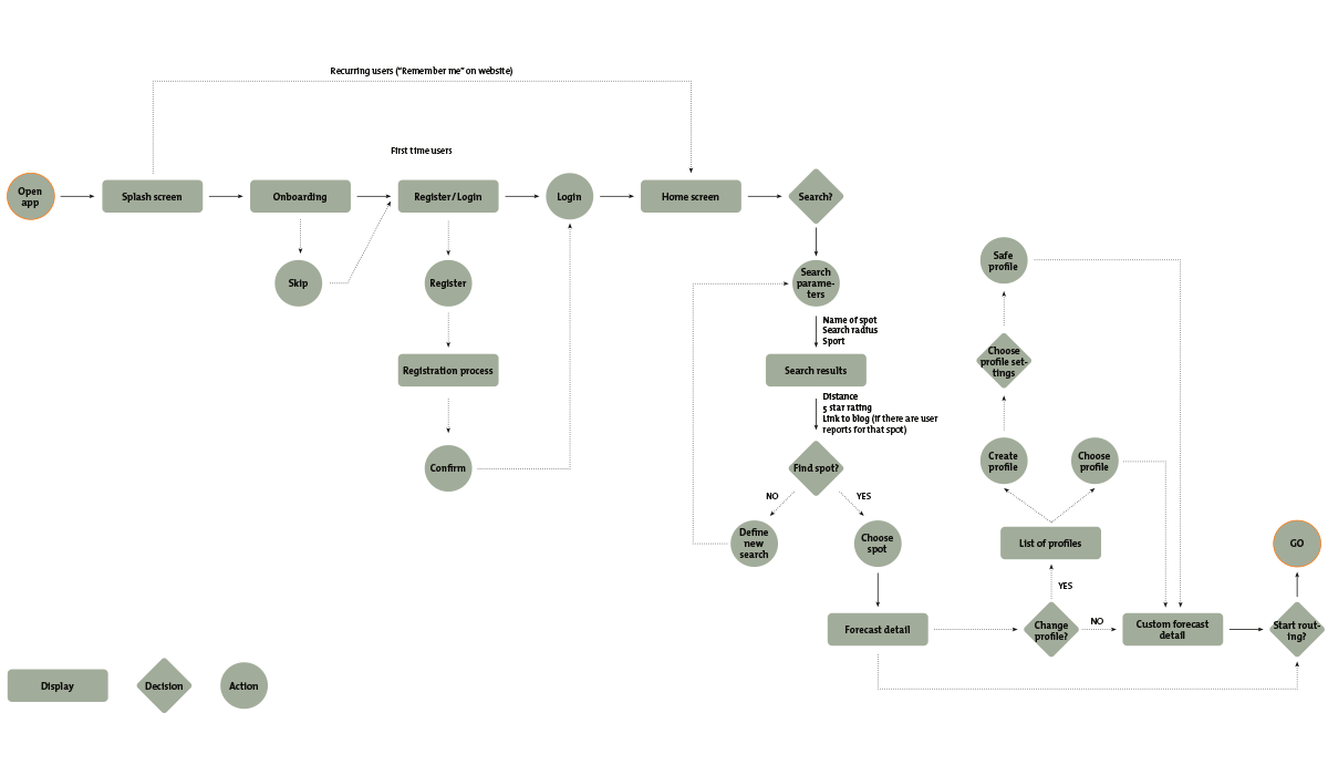
Now that the user is firmly anchored in the centre, the first ideas for implementing the app can be fleshed out. After a task analysis, the first user flows were designed and an initial sitemap was created.
User Flows
Initial Sitemap
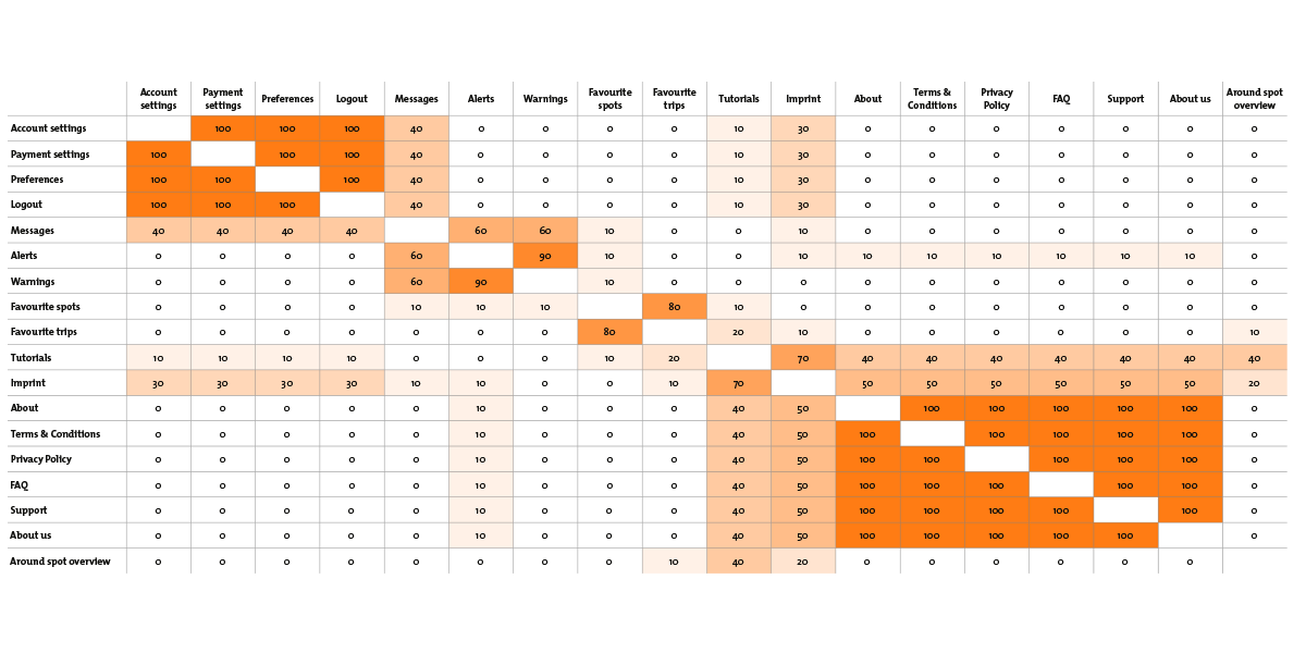
After the first sitemap, card sorting was used to find out whether the allocation of menu items is intuitive enough for users or whether menus and submenus should be sorted or renamed in a different more intuitive way. The result is a revised sitemap.
Card sorting analysis with Similarity Matrix
Revised Sitemap
Bring ideas to live
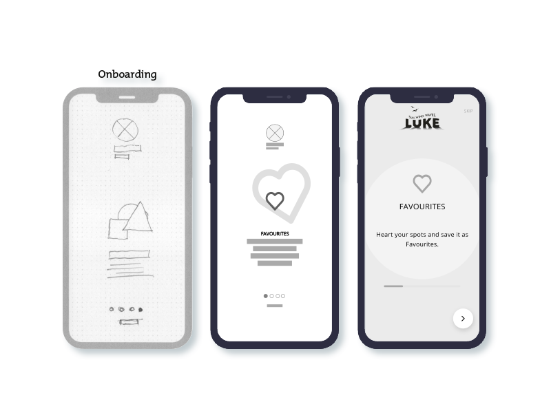
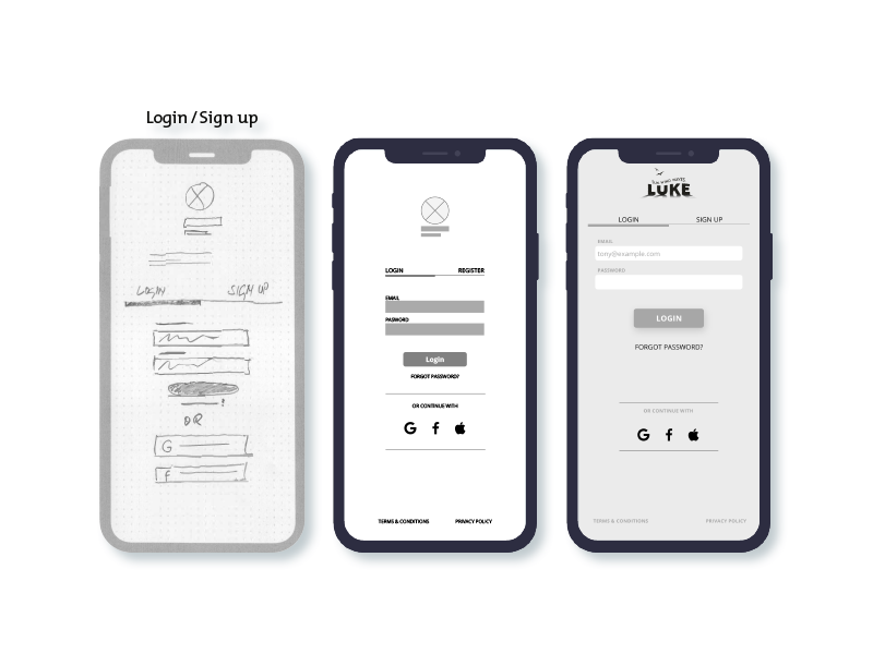
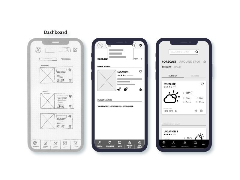
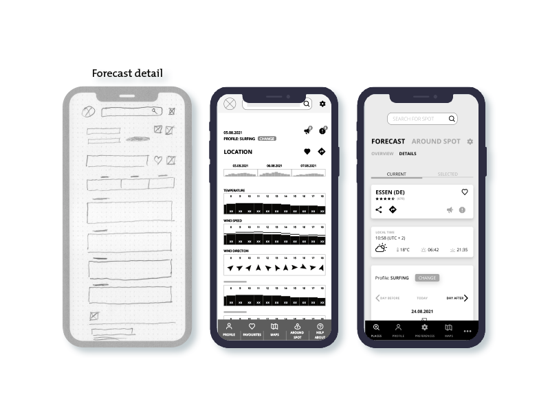
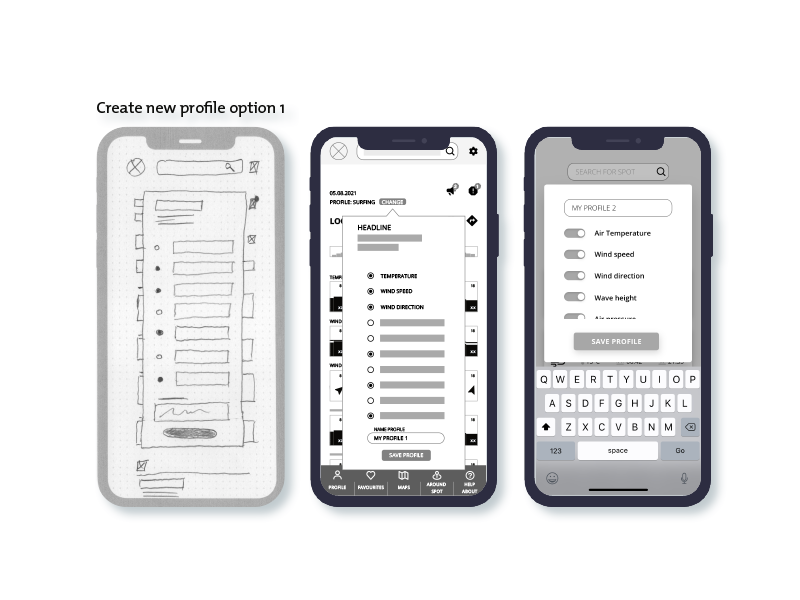
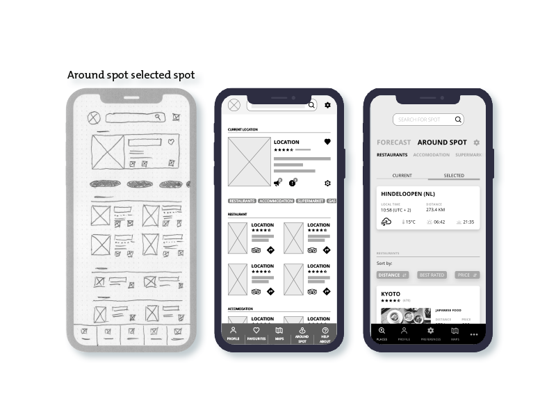
With the results from the previous phases, a good basis was available to implement the first ideas in wireframes. First quick sketches with paper and pencil, then from lofi to hifi wireframes in greyscale.
From quick sketches to hifi prototype
The prototype is now ready to be tested with real users.
What do you think?
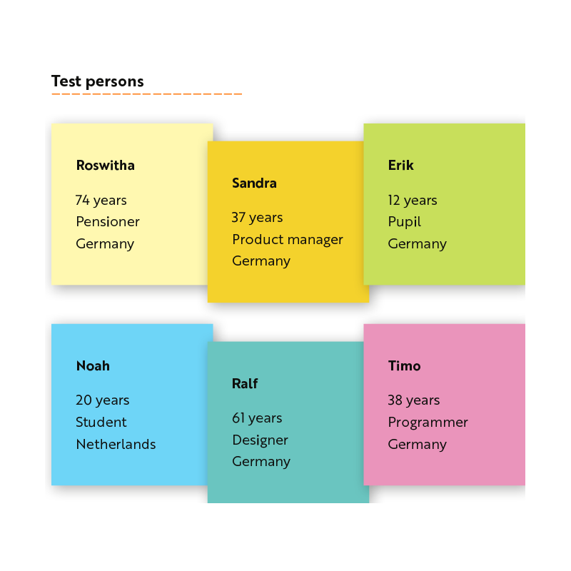
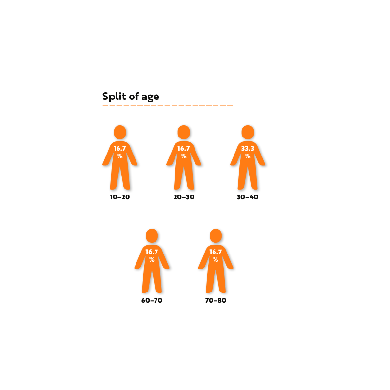
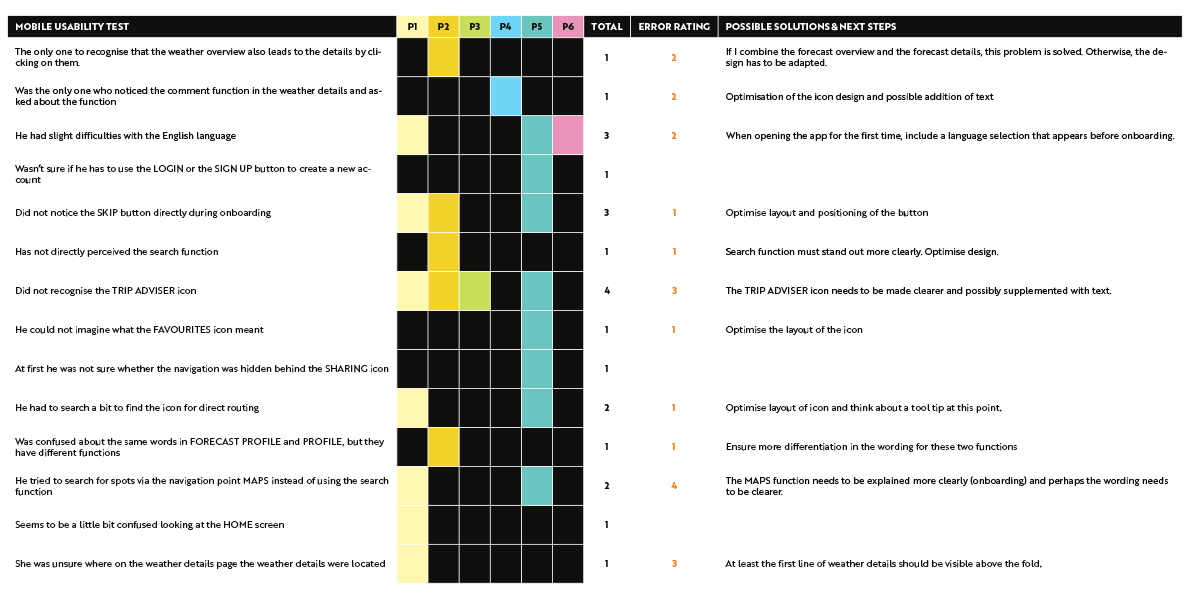
Time to test the prototype on real users and ask their opinion and observe reactions. In preparation for the test, a usability test plan and a usability test script were developed to ensure the same procedure for all tests. In parallel, 6 test candidates were recruited.
Recruiting the test candidates
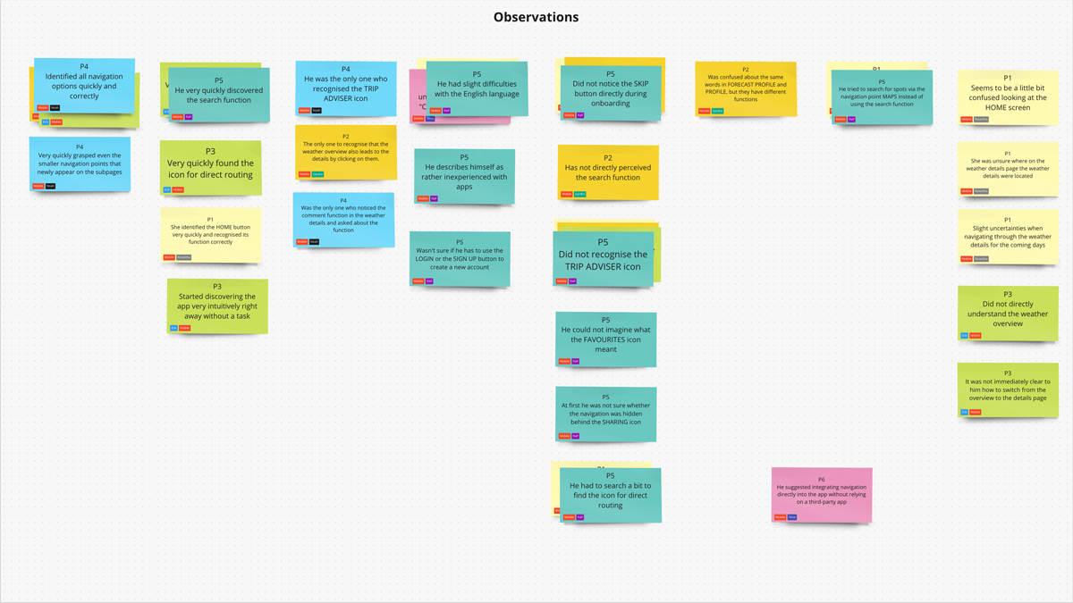
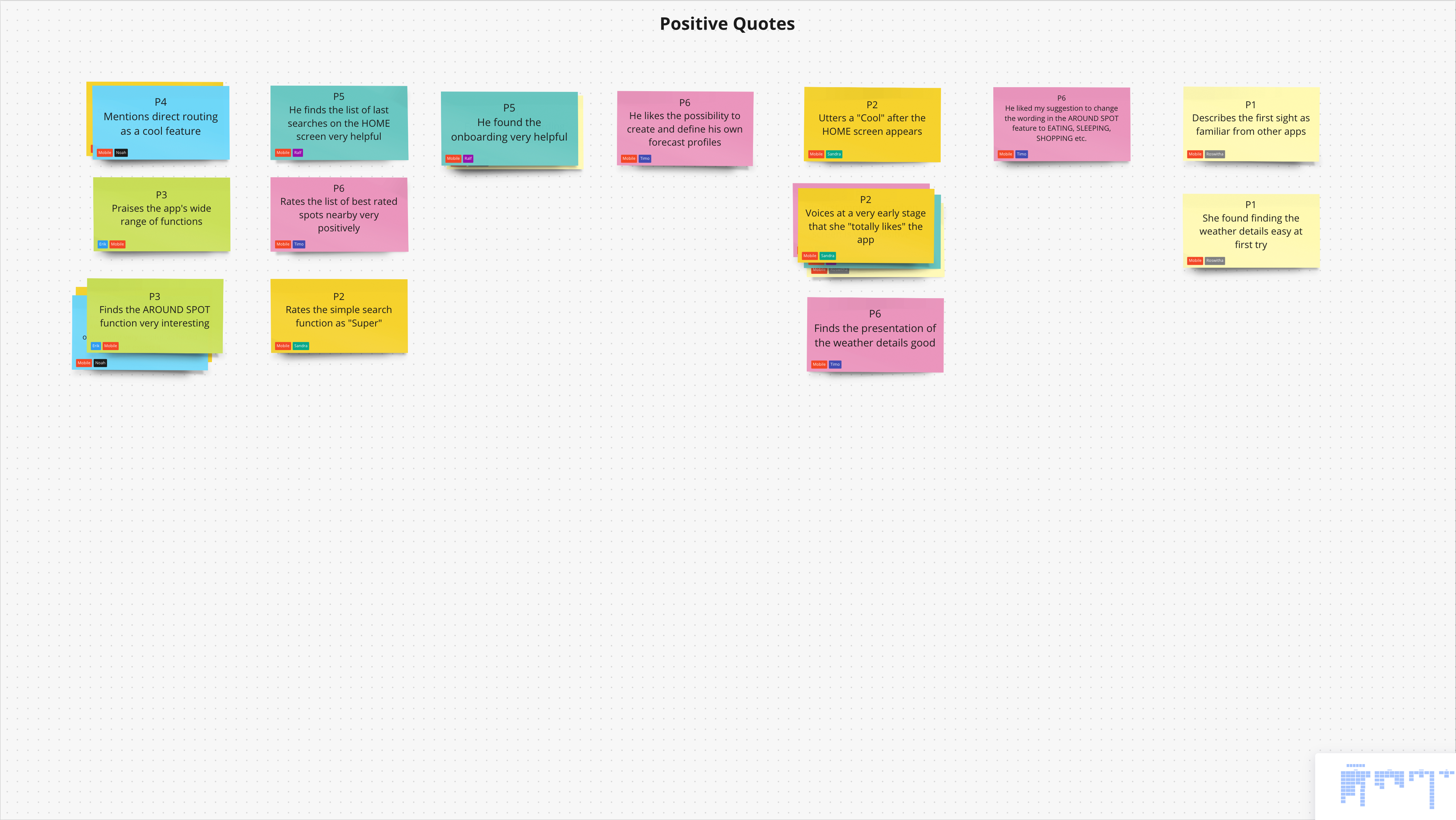
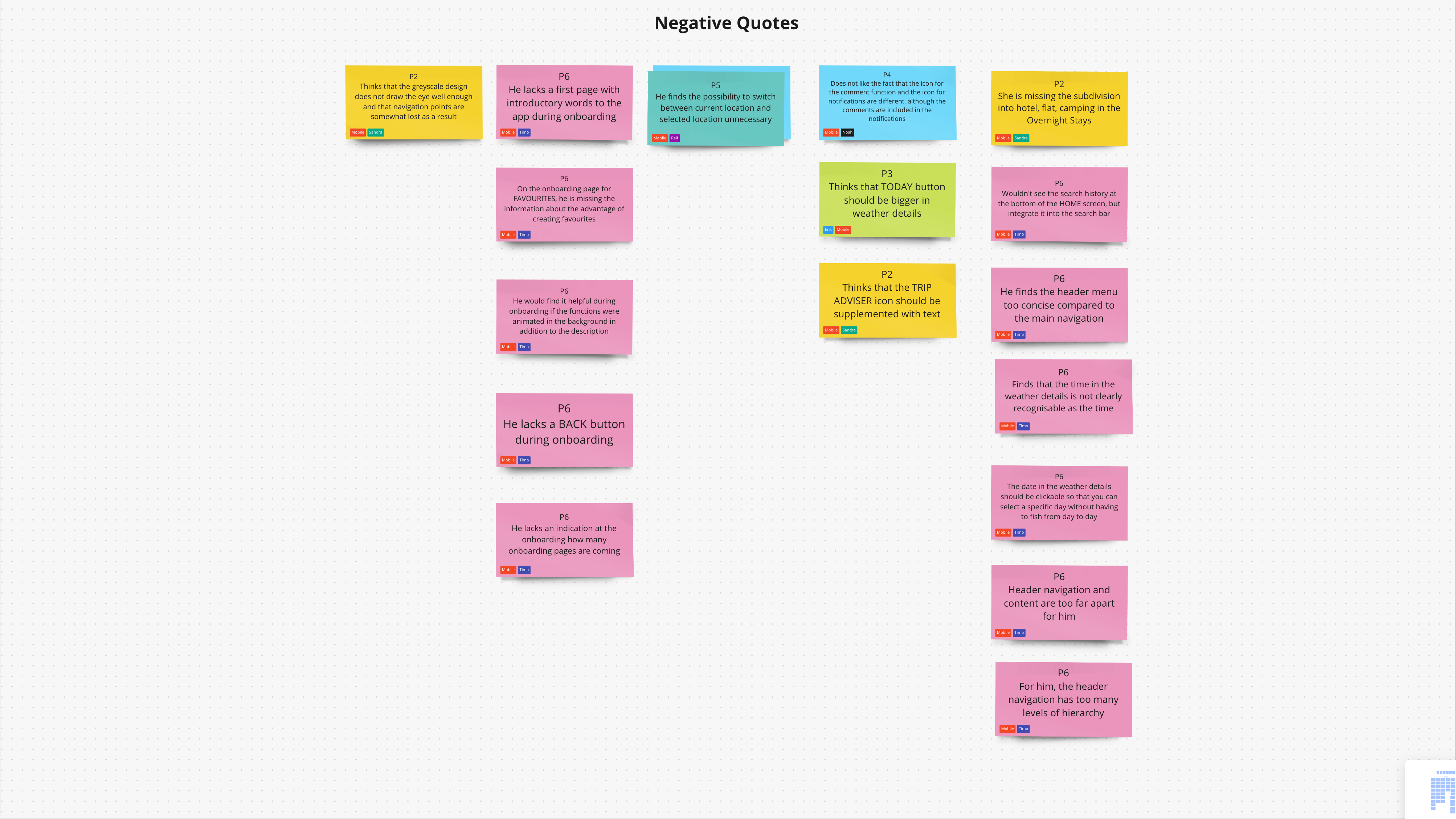
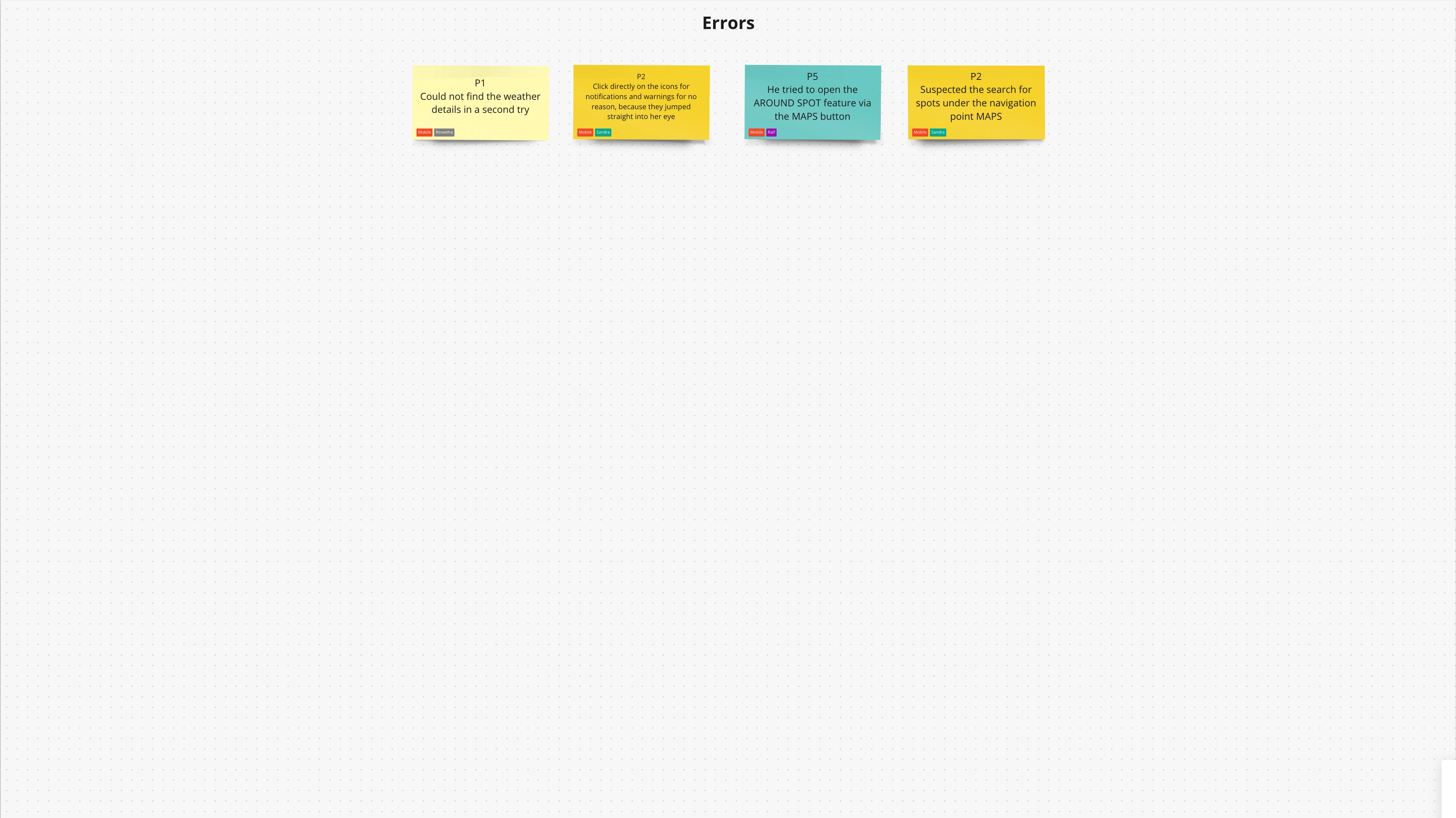
Half of the usability tests were conducted as in-person tests and the other half as in-person remote tests. The pure test time was between 20 and 30 minutes. The subsequent free discussion extended the time to over an hour in some cases. There was a lot of positive feedback, but of course also many observations and comments that needed further evaluation.
All notes and recordings from the tests are clustered in the affinity map.
With the findings from the usability tests and the proposed solutions, the prototype was revised again.
Installing the new the solutions
User tests were carried out again with the revised prototype.
Even more helpful opinions
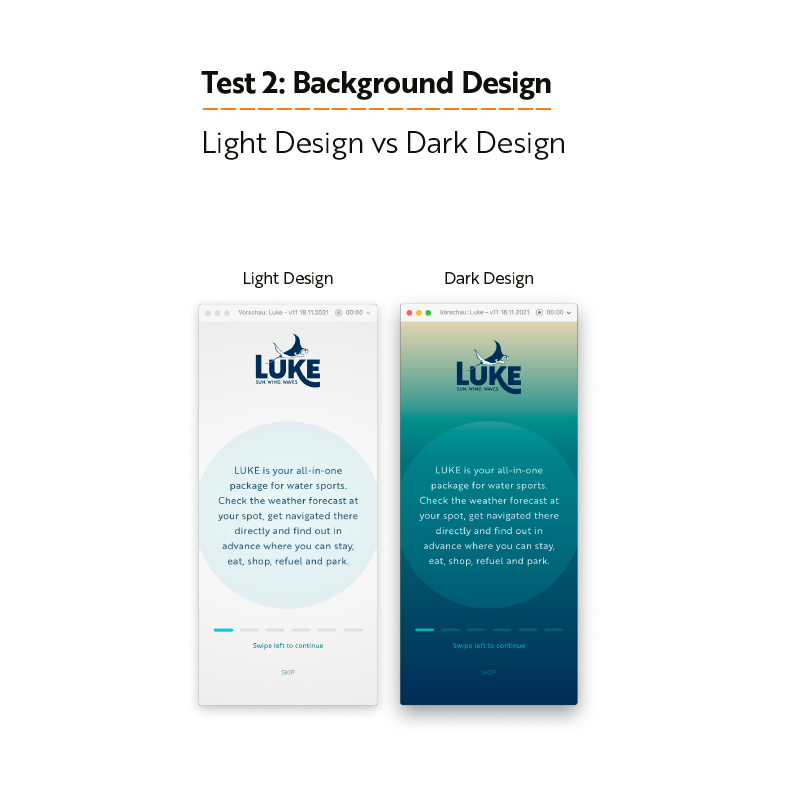
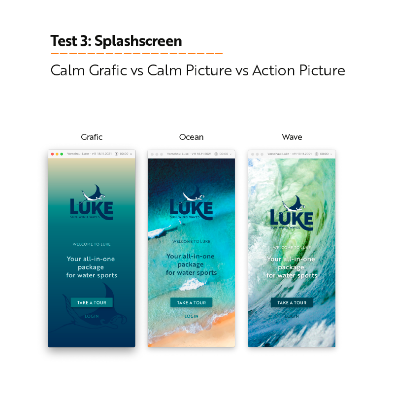
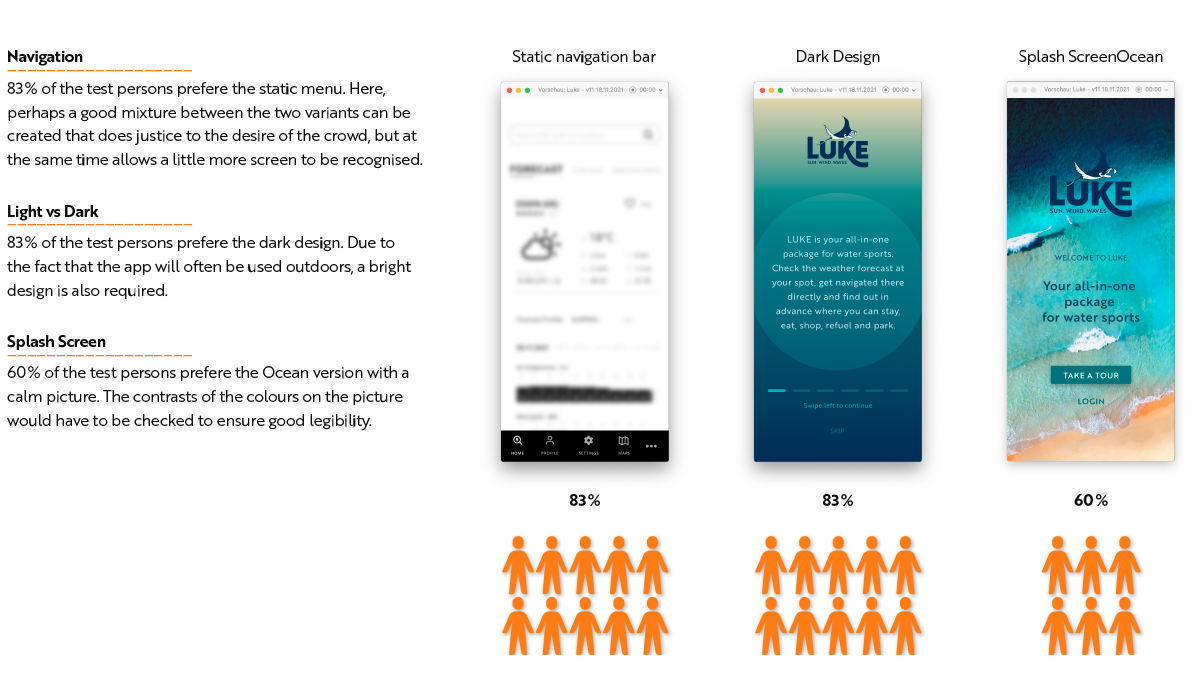
A/B tests were carried out with some of the screens of the revised prototype to test the solutions for their suitability.
Preference Tests
The preference tests were carried out with 12 test candidates in an online test.
Voting of the users
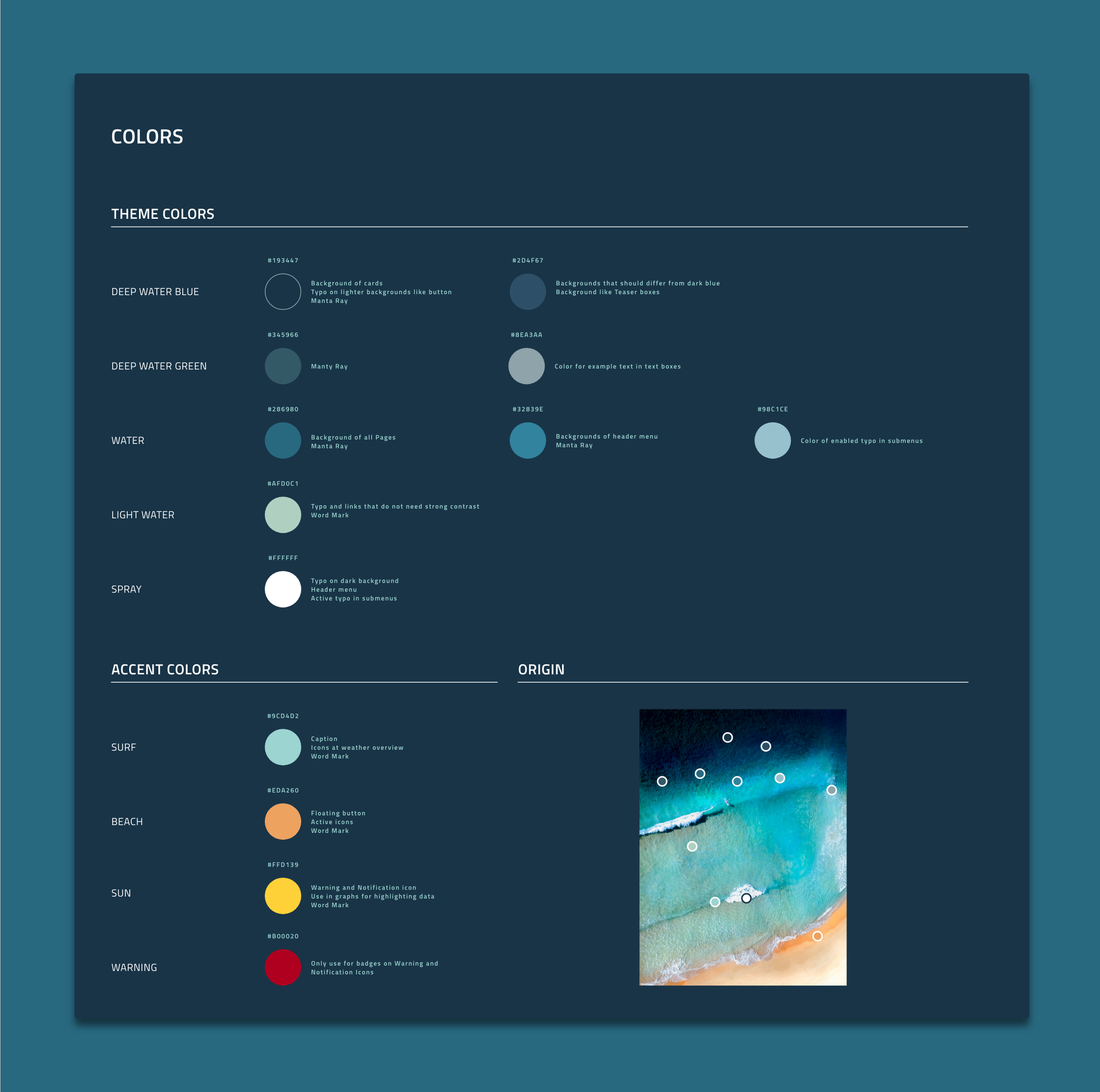
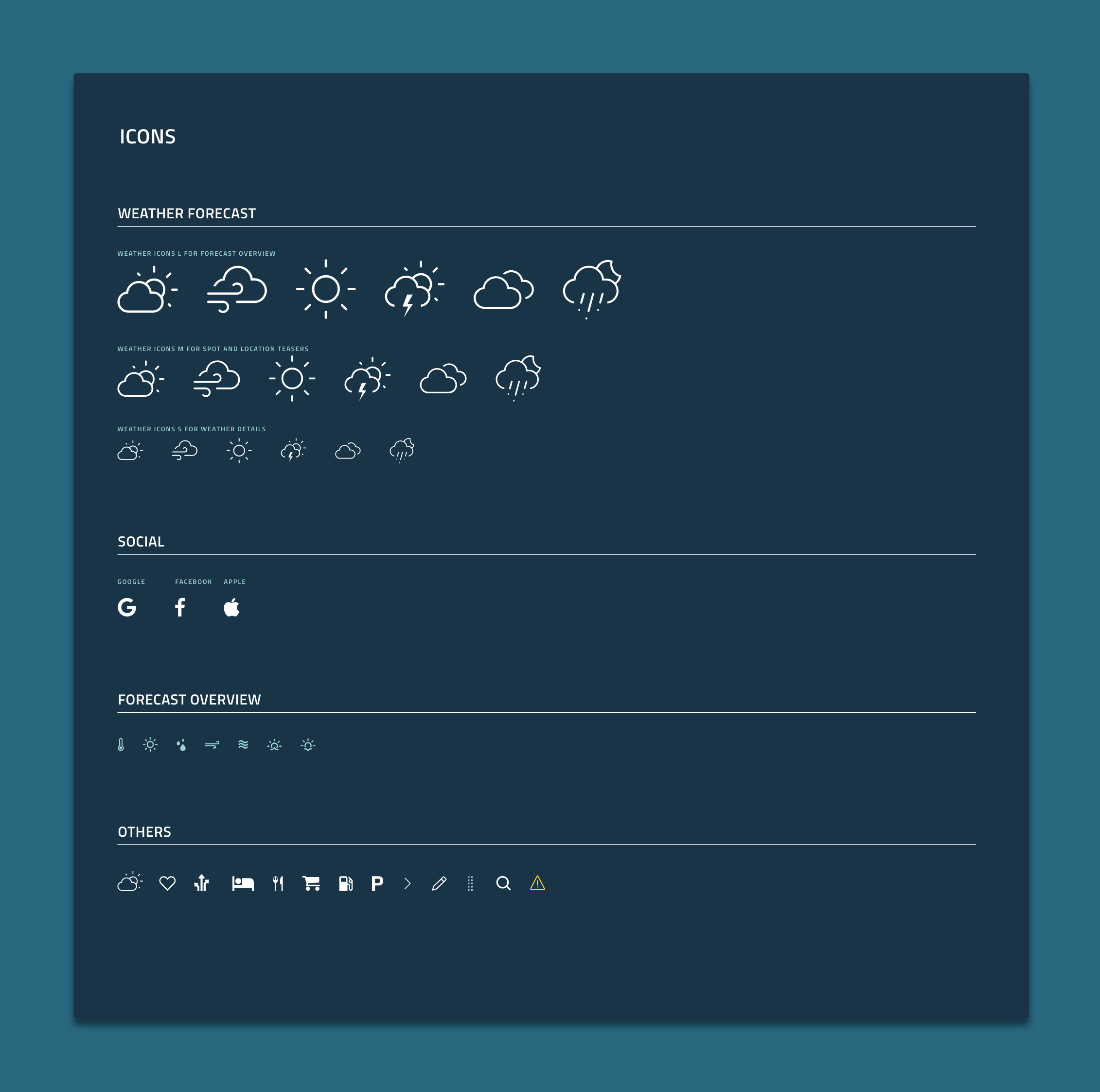
Make it fine and make it colourful
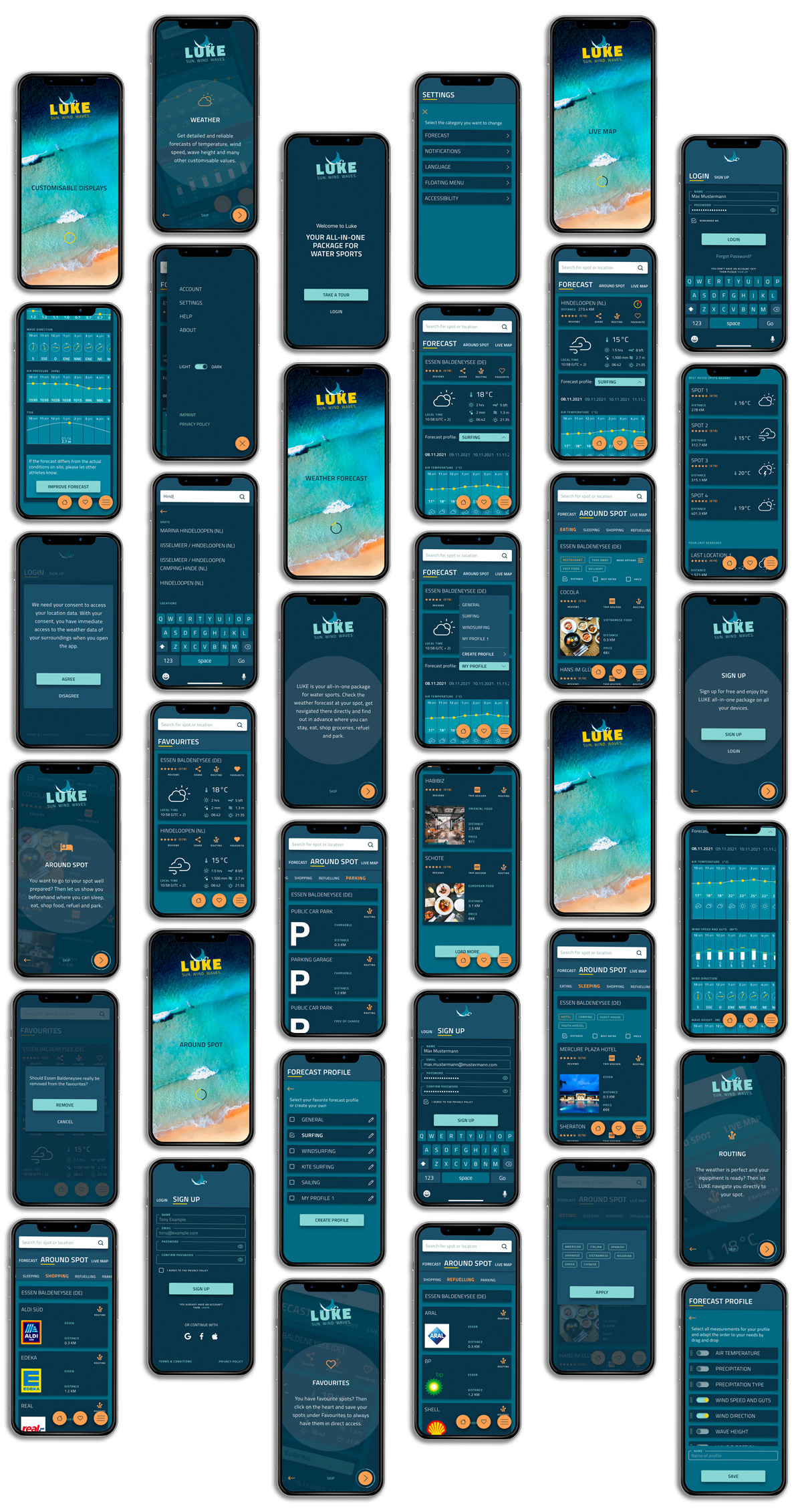
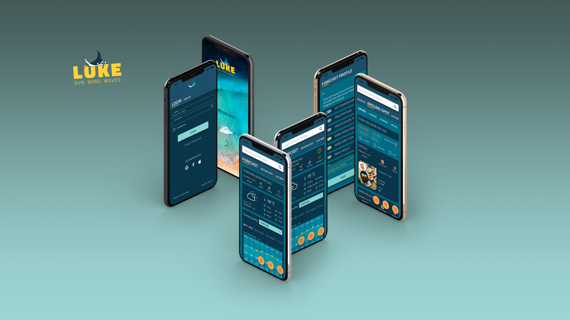
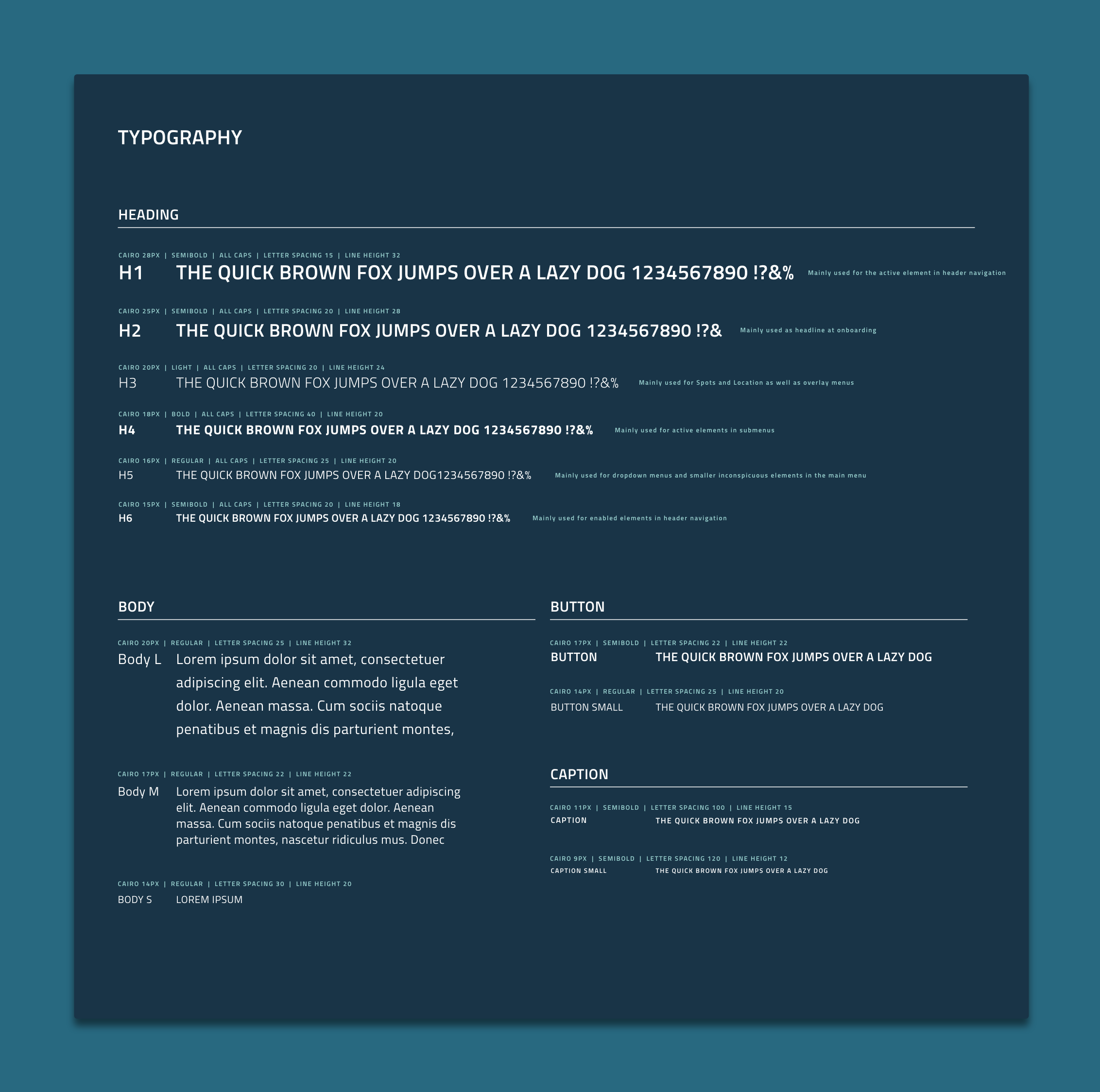
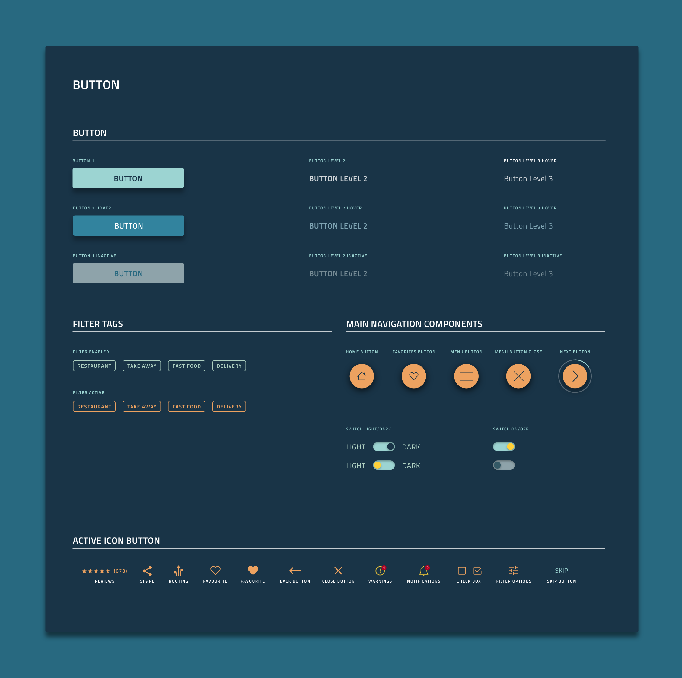
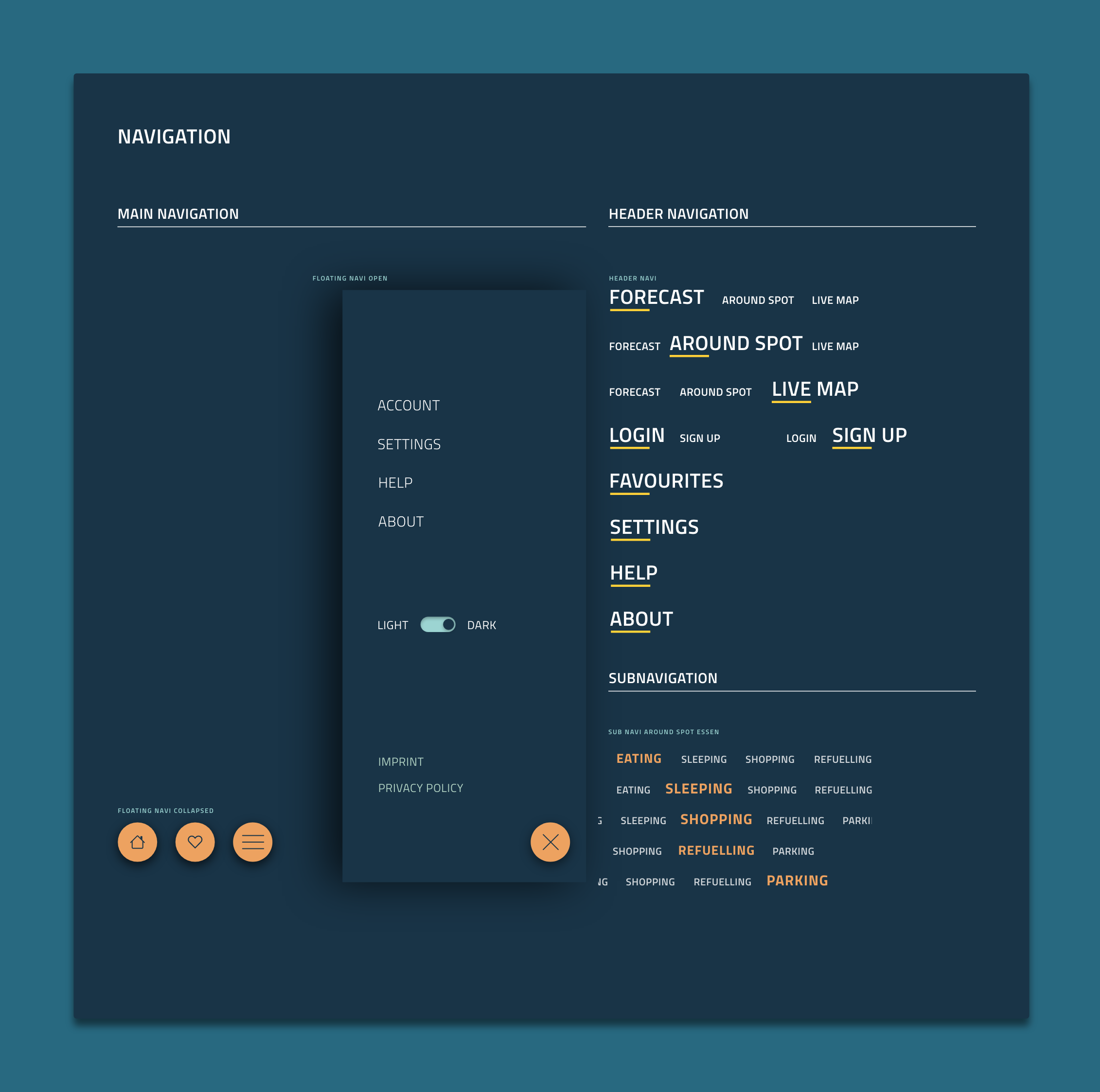
After completion of the tests, the finalisation of the prototype began. Starting with the style guide to the final prototype that can be handed over to the developers.


